@misc{doubleml,
  title        = {DoubleML},
  author       = {Bach and Chernozhukov and Kurz and Spindler},
  howpublished = {\url{https://docs.doubleml.org/}},
  note         = {Software / documentation}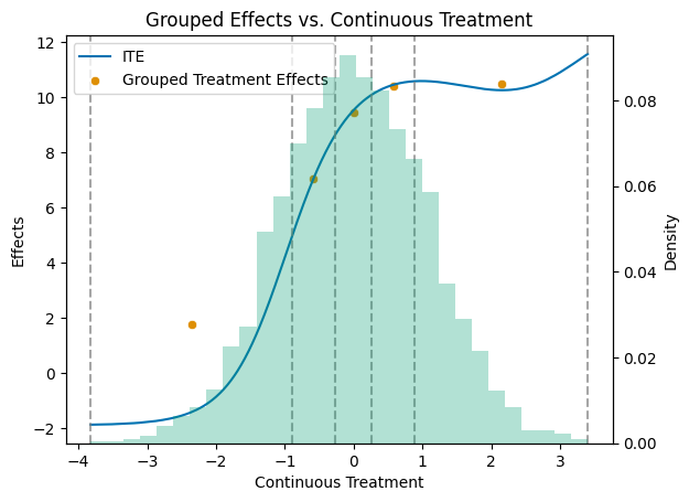
}For a multi-valued or continuous treatment: estimate E[Y(d)] at each dose and the contrasts between them, all cross-fitted.
Input · what goes in
Outcome Y, a multi-valued / continuous treatment D (the dose), and covariates X.
Show data format & exampleHide example
Format — one row per unit: outcome y, dose d, covariates X.
  y    d    x1    x2
 2.1   0    0.4  -1.1
 3.4   2   -0.1   0.6
 1.8   1    1.2   0.3
Pipeline · the recipe ⑂ has parallel branches
↑ Click any step in the diagram to read its logic, code, assumptions & discussion.
Declare the multi-valued treatment
Data preparation — shapes the raw inputs into what the estimator expects.
Set up DoubleMLData with the dose as the treatment.
dml_data = dml.DoubleMLData(df, y_col='y', d_cols='d', x_cols=X)
- No comments on this step yet — be the first.
Log in to comment on this step.
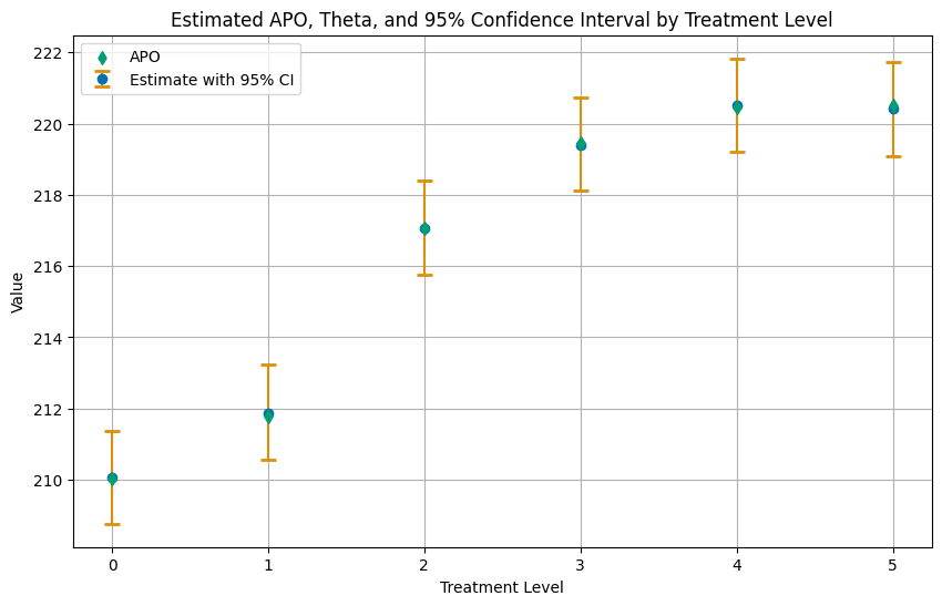
Average potential outcome at each level
The core estimate — where the causal quantity itself is computed.
An orthogonal APO per dose level, cross-fitted with ML nuisances.
apo = dml.DoubleMLAPOS(dml_data, ml_g, ml_m, treatment_levels=levels).fit()
- No comments on this step yet — be the first.
Log in to comment on this step.
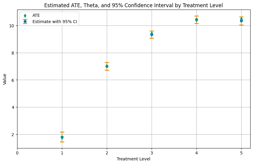
Contrasts between doses
Uncertainty quantification — standard errors, intervals, and aggregation.
Differences of APOs give causal effects of moving from one dose to another.
apo.causal_contrast(reference_levels=0)
- No comments on this step yet — be the first.
Log in to comment on this step.
Plot the dose–response curve
Reporting — turn the numbers into a figure or table a reader can act on.
E[Y(d)] across the treatment range, with confidence bands.
# dose on x, APO on y, with CIs
- No comments on this step yet — be the first.
Log in to comment on this step.
Output · what you get 4 figures
![Average potential outcome E[Y(d)] estimated at each treatment level.](https://docs.doubleml.org/stable/_images/examples_py_double_ml_apo_14_0.png)
Figures reproduced from DoubleML — Bach, Chernozhukov, Kurz & Spindler — unofficial community showcase; all credit to the original authors.
⚠️ Unofficial community showcase of a DoubleML example. Not affiliated with the authors; figures are from the public documentation. All credit to Bach, Chernozhukov, Kurz & Spindler.
For a multi-valued or continuous treatment: estimate E[Y(d)] at each dose and the contrasts between them, all cross-fitted.
Discussion (0)
Log in to join the discussion.